Final mobile app screens
How might digitally-enabled experiences foster safe, inclusive, and barrier-free sport? We investigated that question with real people across 4 countries, then built a mobile app to answer it.
This was my Sheridan College capstone project, completed in partnership with Team Canada as part of their Impact Agenda. Our team "Morning Owls" was challenged to design digitally-enabled experiences that foster safe, inclusive, and barrier-free sport through one of Team Canada's three pillars: Podium, Play, or Planet.
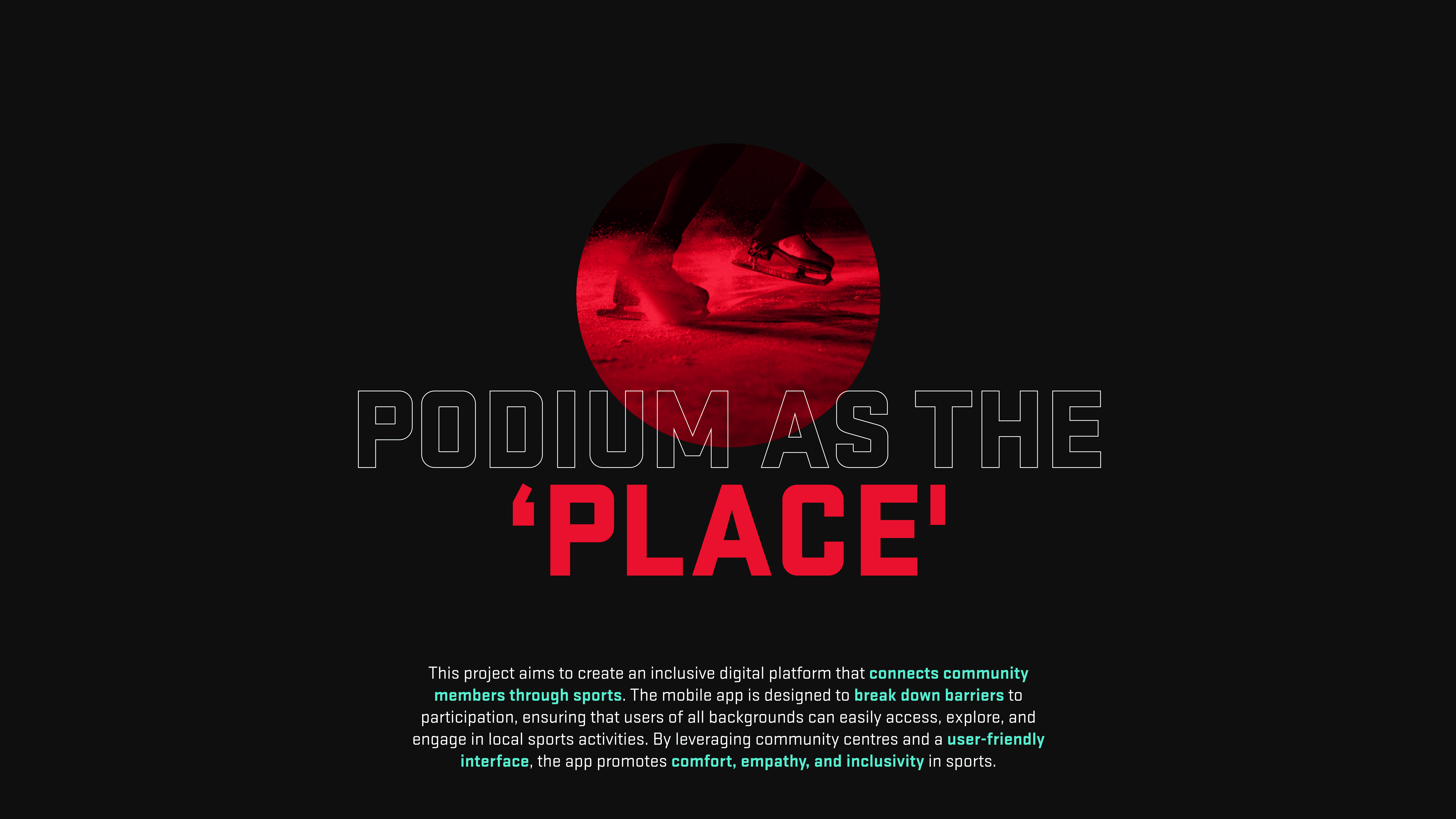
We chose Podium, but rather than interpret it as elite athletics, we reframed it as a "place." A space where sport becomes genuinely accessible to everyone, regardless of background, skill level, or cultural identity. The result was a mobile platform connecting community members to inclusive local sports events.
I wore two hats on this project. As Customer Representative, I was the primary liaison between our team and Team Canada, tasked with gathering requirements, translating partner feedback, and making sure our work stayed aligned with their expectations throughout. I attended all partner check-ins, documented requirements, and communicated changes back to the team.
As Designer and Checker, I critically evaluated our team's concepts and contributed to visual design and prototyping. I was responsible for making sure what we built was both thoughtful and executable, calling out when something looked good but didn't solve the actual problem.
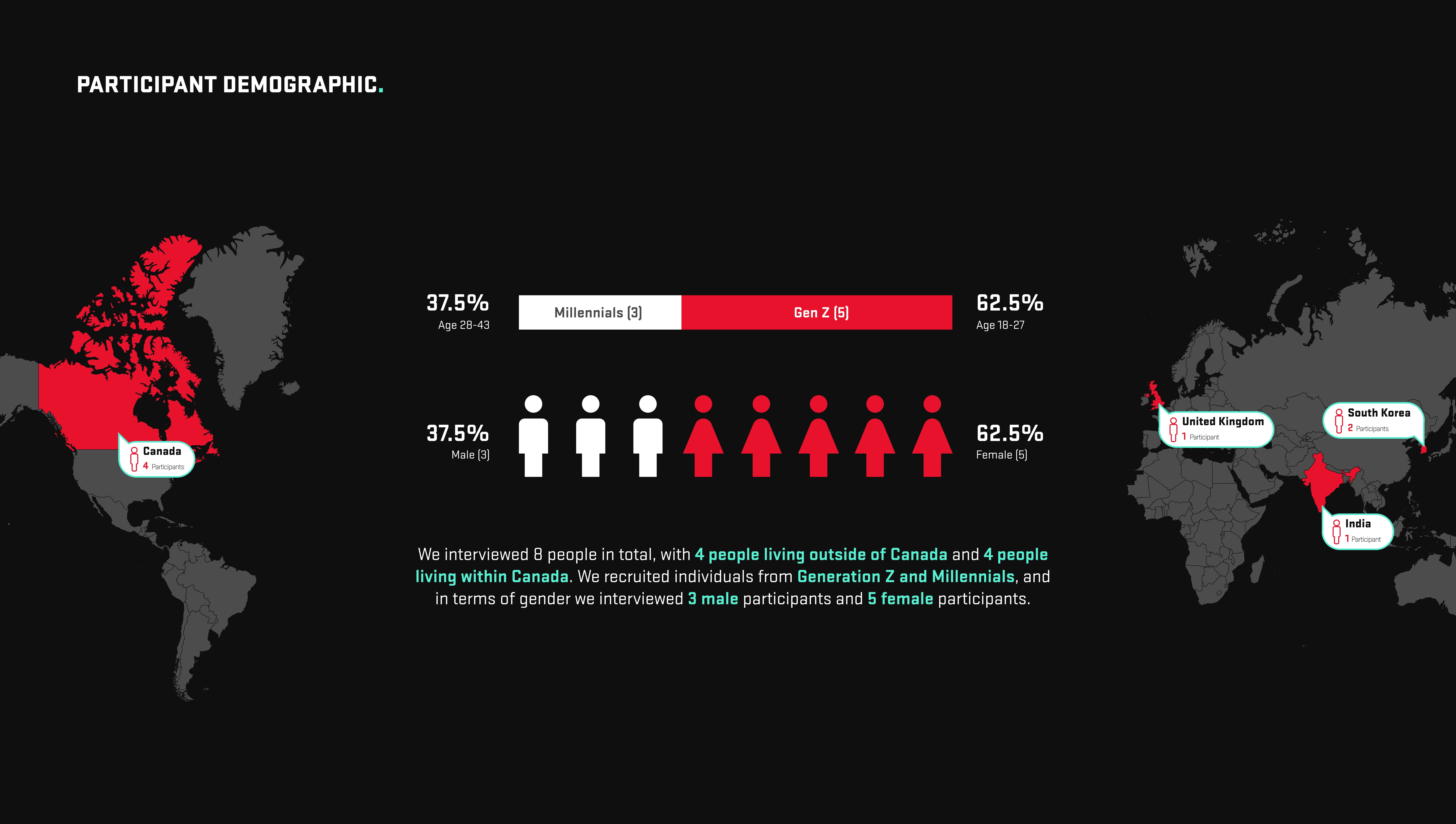
Before touching any design tools, we went into the field. We conducted in-depth, one-on-one interviews with 8 participants spanning Canada, the UK, India, and South Korea. All were 18+ and active in sports or recreational programs. We recruited deliberately across gender, generation, and cultural background.
3 male · 5 female · 3 Millennials (age 28–43) · 5 Gen Z (age 18–27). The conversations were candid and often surprising.
Everyone plays sports, but enjoyment is not guaranteed. Participation alone doesn't mean inclusion.
Barriers don't discriminate. Cost, language, safety fears, and social anxiety affect people across every demographic.
Inclusivity is not one-size-fits-all. What makes a space safe for one person can make it unwelcoming for another.
There's no such thing as individual sports. Community and belonging are always part of the equation.
Canada as a cultural mosaic is a double-edged sword. Celebrated diversity can still produce quiet exclusion.
People want to belong, but many won't ask for what they need in order to feel safe enough to try.
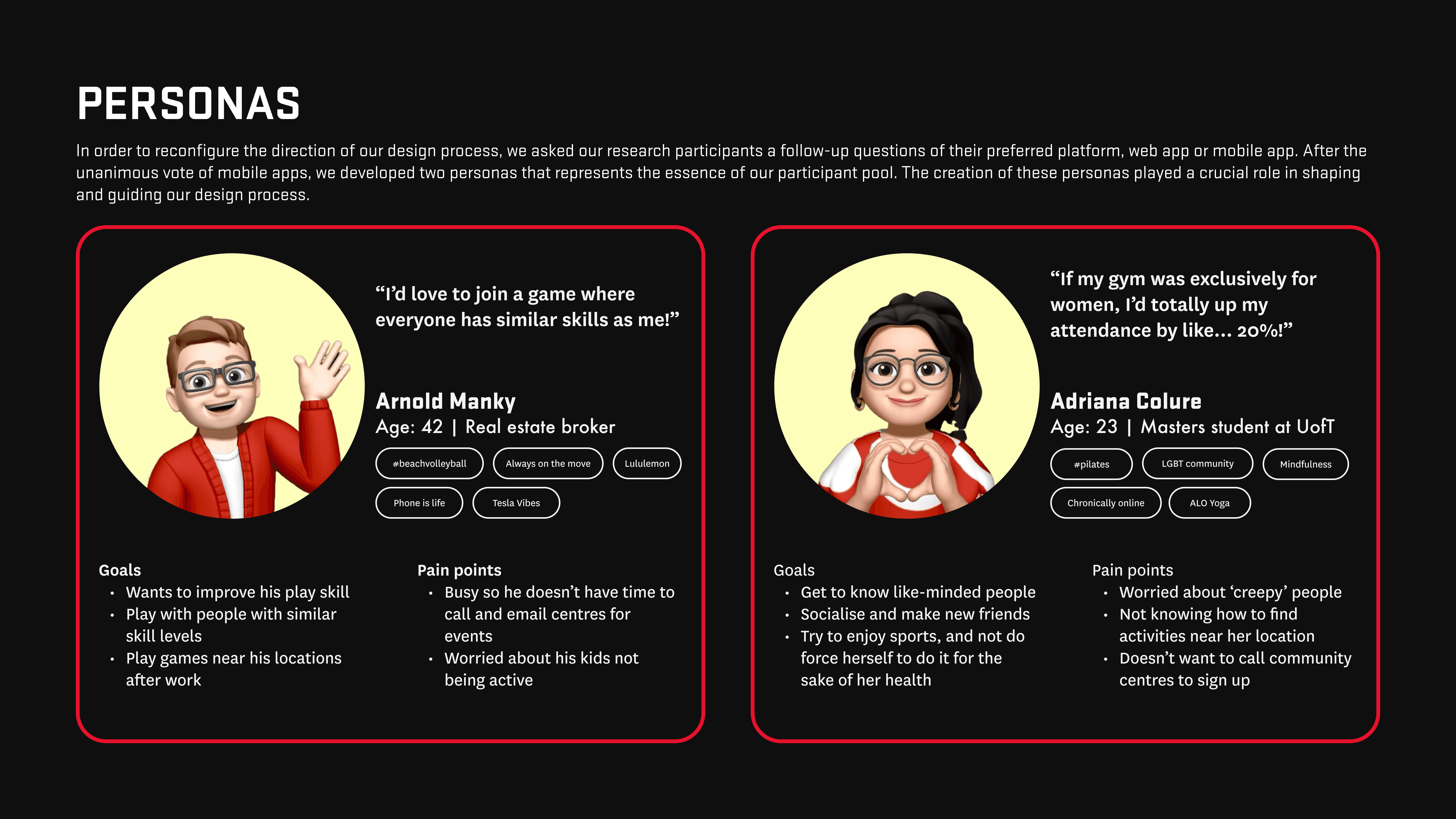
After research synthesis, we developed two personas grounded in real participant patterns, not assumptions.
"I'd love to join a game where everyone has similar skills as me!"
"If my gym was exclusively for women, I'd up my attendance by like... 20%!"
After initial desk research, we began prototyping a web application. It made sense on paper; broader accessibility, no download required. But when we pressure-tested early screens, the complexity of features we needed didn't translate well to a web layout at all.
We went back to participants with a direct question: web app or mobile app? The answer was unanimous — mobile. This decision unlocked everything: QR-based event check-in, location-based filtering, push notifications for live events, and a more personal, on-the-go experience.
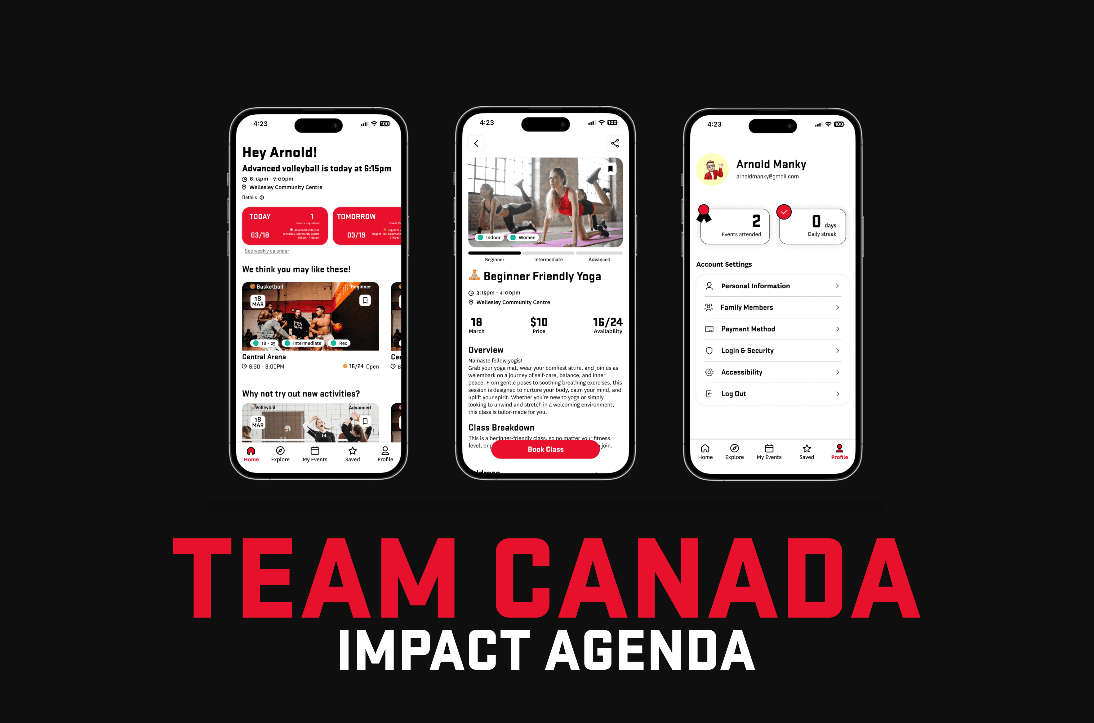
We designed a mobile platform where community centres and private fitness operators sign up as event organisers and list sports activities. Users discover events, filter by what matters to them, and RSVP in seconds. The platform is built around genuine inclusivity, not just a checkbox.
Key screens:
We built a design system to keep the team aligned across five designers. Typography used Stratum2 for headings (bold, structural) and National for body text. The colour palette centred on Team Canada Red alongside Dark Grey, Light Grey, and an Aquamarine accent were chosen to feel both official and approachable.
Spacing and sizing followed a multiple of 4/8 grid applied consistently across components, buttons, and spacing tokens.
This project pushed me in ways I didn't expect. Coordinating between a real partner organisation and a five-person team taught me how much of product design is communication and not just pixels. My dual role meant I was constantly translating between what the client needed and what users actually wanted. Those aren't always the same thing, and navigating that tension was one of the most valuable things I learned.
The pivot from web to mobile was uncomfortable in the moment but made the product dramatically better. That experience reinforced something I now carry into every project: stay curious, stay flexible, and let the research lead. Designs are hypotheses. People are the test.